Projects:
Final Project:
For my final project I decided to do a self portrait in colored pencil. For my facial expression, I decided to do it kind of serious but calm and relaxed, which can be seen as my usual natural facial state. My favorite part is probably the contrast of my dark hair to the paleness of my face, because it created a natural contrast within the artwork. I chose the background to be simple so that way I am the main focus, I also chose one of my favorite colors as well to do. I really liked the way this turned out, because at first I was really worried about what the outcome would be. I thought I was going to have to draw the base over and over to get it right, but it actually came in one try. This is mostly because a lot of people struggle with trying to draw themselves, including me and can find it a very difficult task. I finally decided to go through with it and try it out for my final. I'm very happy that I took the risk of it possibly failing because I'm very proud of the progress I have made with self portraits.
Social Issues Project:
For my Social Issue project it's about showing respect for veterans. A lot of people don't realize what veterans go through each and everyday. Every single veteran is affected by their service, they may face certain health problems, employment issues, and much more. So for my project I am painting a veteran in a wheelchair that lost his leg in war, a younger kid will be holding open the door for him. The setting is going to be at a post office, in my opinion it just kind of connected to the theme in a light way that I don't know how to explain. The younger kid holding the door open for the veteran symbolizes for future generations to keep good respect for veterans and their service. The flag hanging on the pole in front of the office symbols liberty, justice, freedom, love of country and national purpose. The words in the window represent the veteran and describe the main words connected with veterans. I just feel like it is so important to respect and honor them in any way that we can. They represent the highest ideals of our country. We will never fully be able to compensate the debt we owe the heros, but the best way we can would be to honor their services and provide them the care and support they deserve.
Culture Project:
For this culture I decided to choose Japan. In my project I made a Japanese style fan, which was a little complicated but turned out pretty well. Instead of just making a fan, I decided to do a portrait of a Geisha, which is a main key point in Japan culture. A fun fact about Geishas is that, if they have hand-held fans, they are considered much more suitable for elegance. Which is kind of another reason why I combined both into one piece of art. I have never made a fan like this before, so I had to practice making one before starting on the real one. I hand made the fan by making holes at the ends of popsicle sticks, I then stuck a wire through at least 10 popsicle sticks, and coiled the ends tight to add support to keep them together. I then fanned the popsicles out to make the "skeleton" of the fan for the base. For the design of the fan, I drew a flying dragon and a prowling tiger, the symbol of them together means Heaven and Earth. I just drew it on regular paper in a fan shape, once completed I added it to the fan and glued it down. For the Geisha, I am using oil pastels to give a more pasty/traditional look, to give off the traditional geisha makeup look. I had a lot of fun doing this project, exploring Japanese culture and what all it holds. (The last 3 slides were testings of mediums to decide which one I liked best. I chose oil pastel because i feel it gave kind of the effect of the makeup they wear. The practice drawings look really bad because I drew them in like one minute just to make a quick base to practice on before actually doing it on my final.)
Silk Screen Printing:
For our Silk Screen Printing project. I decided to do a dragon design, something different for me to do. Plus I would like to have a dragon t-shirt because I think it would be cool to have. or at least for my liking I do. This project can be kind of challenging especially if you have never done it before. I think this project so far has not been too bad, but not the best making process either (It can be complicated), but at least I tried something new. I did a lot of test runs to see how each print would be different, some would smudge more, not print, or print perfectly fine. Most of the time that they wouldn't show up enough was either when I didn't add enough pressure or my screen was getting clogged. So by this, I wouldn't press too hard, but not to light either because it won't show up. My favorite ones are more upfront while the messups/trials are at the very end of the slideshow. (The red ones were my first day of printing, that's why there are so many of them. But there is some green/blue/white ones at the very end.)
Final Project:
For my final project I decided to draw Audrey Hepburn. She is someone I have never drawn before, so it was quite a challenge to get her features down to the best I could. I'm quite impressed and proud for the way it turned out, mostly because I've never drawn her before, so I kind of see this as growth for me. Mostly because I reached out of my comfort zone and went for someone totally different that I would never go for. I wanted to go a different route and choose a different person which is why I chose her, I never hardly see Audrey Hepburn drawn and displayed for Art. To practice some of her features that I struggled with or would worry about doing, I practiced on another piece of paper. (They are included in the slideshow). I decided to change the shadow underneath her neck because I felt it was too dark in the photo and when I did it on the drawing it was too dark for my liking, so I changed it to a lighter shade of transition. I also used two reference photos of her and kind of would take some details from both and mix them into one drawing. I tried my best to apply the dark colors of the pencil to achieve the richness of her dark hair and eyes, as well as other dark places on the image. I am so happy I listened to myself and reached out of my comfort zone to try to draw someone new because it is always good to grow and try new things.
Projects:
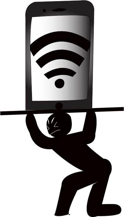
An Image is Worth A Thousand Words:
In this project we had to draw something simple that is worth a thousand words. I chose to draw someone holding up a huge phone. The person is struggling and having a hard time to keep it up and handle it. Phones can be hard to handle and uphold for some people, whether it is social relations with people, apps, social media, anything... the list is endless. The weight of phones can cause a harsh impact on people. Which is represented in the drawing by having the person hold up the phone, showing the struggle of the weight phones can have on people. Yes phones can have positive impacts as well, but most of the time they cause troubles, fights, drama and much more. I feel like phones have a very negative affect on todays society, which will just keep increasing and increasing. Such as (Anxiety, Bullying, etc...)
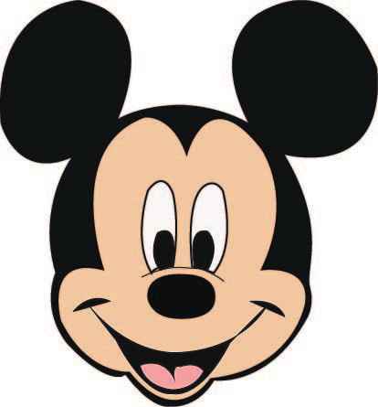
Graphic Art Practice:
For the intro to the project "An Image Is Worth A Thousand Words", we had to practice drawing something using digital art. I decided to trace/draw Mickey Mouse. This is not one of my favorite projects personally, mostly because I like hands on art like painting, drawing, etc... But it is always worth trying something new, because you never know if you will have a new interest in it.
Fauvism Project:
For this project we had the choice to draw an animal or a person. I decided to draw my sister, mostly because I have never drawn her for a project before so it would be a challenge. I decided to change the face angle a little bit so that way her face isn't on the right side more like in her actual photo, so in mine I drew her more in the middle and face directed more straight forward with a little bit of a head tilt. But anyways, the only catch is with Fauvism instead of using regular skin tones, you use all kinds of different colors. In a way the colors are applied it kind of reminds me of paint. I basically used colors of different shades to represent color shading of where darker colors would be and highlights would be. So for example deeper shades of red and blue for contouring the face to help the cheek bones pop. When I add different levels of shading of colors it creates value and really gives the drawing depth. At first I did not like this art project at all, but after I started applying colors my opinion on it kind of changed. I actually kind of like it now, because the way with applying the colors and different choices, it gives you somewhat of freedom of colors that you want to choose. Otherwise sometimes when you draw someone it can be really hard to match the perfect skin tones. So I will say this project was better than I thought it would be.
Georgia O'Keeffe Project:
In this project we learned how to work with charcoal and use drawing large as a main focus. At first I thought I wasn't going to like this project until I used charcoal. I've never really used charcoal on projects so it was something kind of new to me. I decided to draw a horse also something I'm not familiar with drawing as well. Before I started my real project I did a practice drawing of my horse so that way I could get the feel of different techniques and ways to use it to help improve my future project. My real project was a little bigger than my practice, but it was not that big of a deal though. I like how the dark of the horse contrasts with the white of the background. While using charcoal, I would apply different amounts of pressure, which would cause different shades of blacks to create kind of a flow of shades. This will probably be one of my favorite project lessons we do this year.
Creating my Sketchbook:
When I first started making my sketchbook, I took to pieces of some type of cardboard (I ripped it off the back of one of my old sketchbooks that I don't use anymore.) and used it as the hard base for my covers of the book. When I got the appropriate amount of fabric to wrap and cover the boards, I sealed it with Elmers glue. After I folded each flap of fabric over one another so that way it sealed the board I attached my watercolor background. My watercolor background consists of the colors blue, violet, magenta, and gold. The watercolor paper is a great way to add character to your book, but as well cover up the messy part of the fabric and parts of the remaining board. Once I attached my Watercolor background in, it was time to add by pages to the book. I used an amount of 25 pages, which I divided 5 pages into 5 groups. In the middle of the binding on the watercolor paper, I drew 4 dots, marking where I will make holes for the pages. I used the same markings on the pages as well, so that way when I poke hole through the pages to the book, I will run string through them. Once I put the string through the center of the book from the top of the page to the back of the book, I pull it back through to the top again. I have two strings poking out of the white pages, which then I simply tie them together, securing the pages. (cutting off the excess tail of string). I did the same technique from the top of the page to the bottom of the page, for all 5 sections of paper. Once I added all the pages in, I completed my book finally. I spent a total amount of 2 days working on it.
